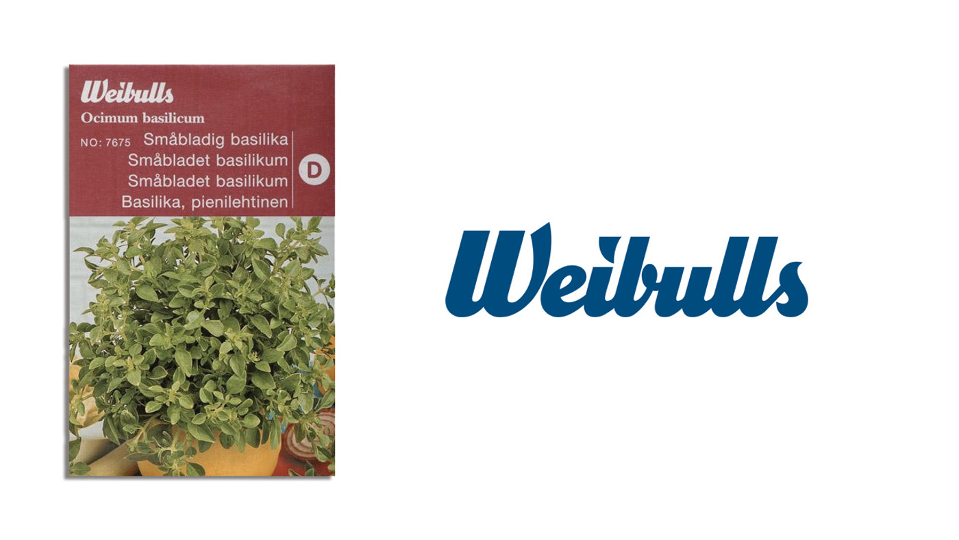
The graphic design magazine Cap & Design contacted Kollor where I worked and asked if we could contribute to their section “Redesign” (“Gör om mig”), picking any brand or product of our own choice to fictively remake. We picked the most established brand in Sweden selling seeds and other garden supplies, Weibulls.
THE SOLUTION
With an extremely tight deadline, but total freedom, I developed a strategic and visual concept. The seed became the core of the communication, a strong and positive symbol with a great potential both visually and verbally, with a good sense of campaignability as well. I created a set of dingbats, “Frödingbats”, that could be typed out as a graphic element by a designer, but also by an employee writing a letter decorated with a final line of pretty seeds. The seeds show up in every visual material. I also did a mockup of an app with handy tips and inspiration.
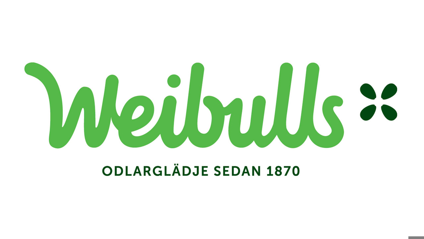
For the payoff, we wanted to highlight the joy of gardening and the historically well-established roots.
The design of the seed packages was very similar between Weibulls and the competing brands. A recycled paper, the new friendlier logotype and a cleaner design would make the packages stand out on the shelves.
The design of the seed packages was very similar between Weibulls and the competing brands. A recycled paper, the new friendlier logotype and a cleaner design would make the packages stand out on the shelves.